Summary
Good Food is a restaurant template built for simplicity. During hours of market research, a problem became apparent, too many restaurants have pdf downloads for menus and unusable, dated web experiences. Good Food sets out to minimize distractions and streamline what the customer wants, the many front and center, and how to reserve a table. The foundation of the template is built on modular sections that can be removed or added to customize the functionality of Good Food for what type of restaurant or foodservice needs a solution.
One of the most common solutions for a restaurant, food truck, or entrepreneur to implement is a pdf downloadable menu. The problem with a static menu is the ability to make edits to price and offerings becomes limited and often only accessible by the graphic designer who created the PDF menu. From the customer’s standpoint, downloading a menu to a mobile device can feel invasive or difficult to find within the mobile device’s file structure.
The need for a useable and simple interface was also a problem in the industry as the age of a restauranter can vary as well as their experience in technology. The need for a mobile platform was also important due to many customers ordering food on food platforms.
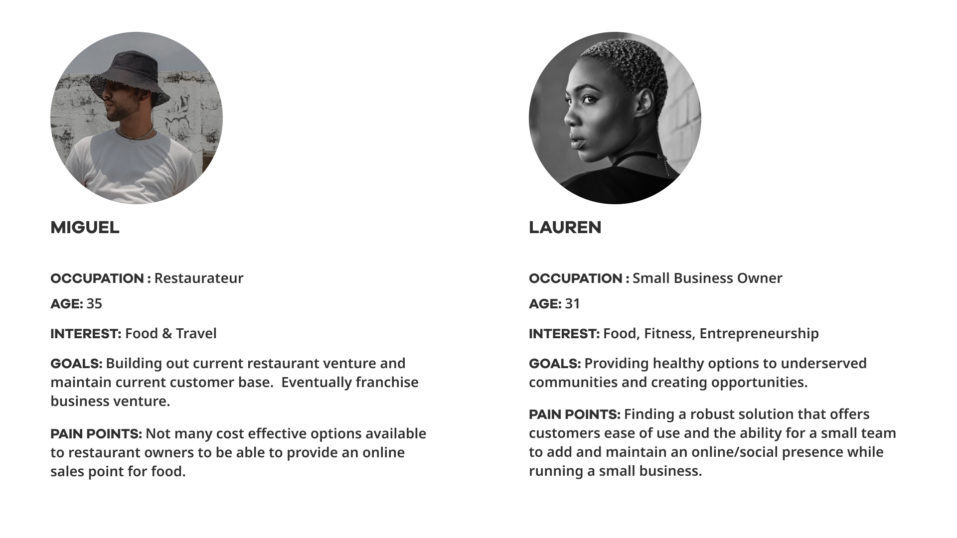
User Profile
The ideal user of Good Food varies in age but is consistent across one need: a concise digital kiosk for their food business. The user envisioned can vary from a young entrepreneur starting a food truck business to an established restaurant transitioning from a cash-based location.
Main Task
- Strategy & Ideation
- Initial Sketches, Lo-fi Wireframes, Usability Testing
- HiFi Prototypes, Front End ( Functional Prototype)
Project Duration: 3 Months
Tools
UX : Interviews, Market Research
To understand the need for a project, action taken in this project was examining the market and all the options for a restaurant looking to add a digital footprint. The most expensive option is a full-scale app solution involving all the costs and development needed, which is out of scope for most mom-and-pop locations. The most common approaches after that are joining a food delivery service such as GrubHub or Doordash, limiting brand recognition, and building customer relationships. The market of themes and simple websites often adds more bloat and unnecessary functions to an otherwise simple user journey.
The interviews included 5 small to mid-sized restaurants and entrepreneurs, the scale of their businesses varied from the delivery of pastries cooked at home to restaurants with multiple small locations. Often older business owners had trouble transitioning to non-cash-based payments and digital platforms due to a lack of confidence in technology usage. Given the training and instruction, all were open to trying a new sales channel for their food business. The cost of the solution was also a big hurdle, as most business owners stated concern about added costs. A common statement was the need for a digital sales channel as most felt business was lost due to not having an optimized way of attracting a more digitally included customer.
UI : Figma
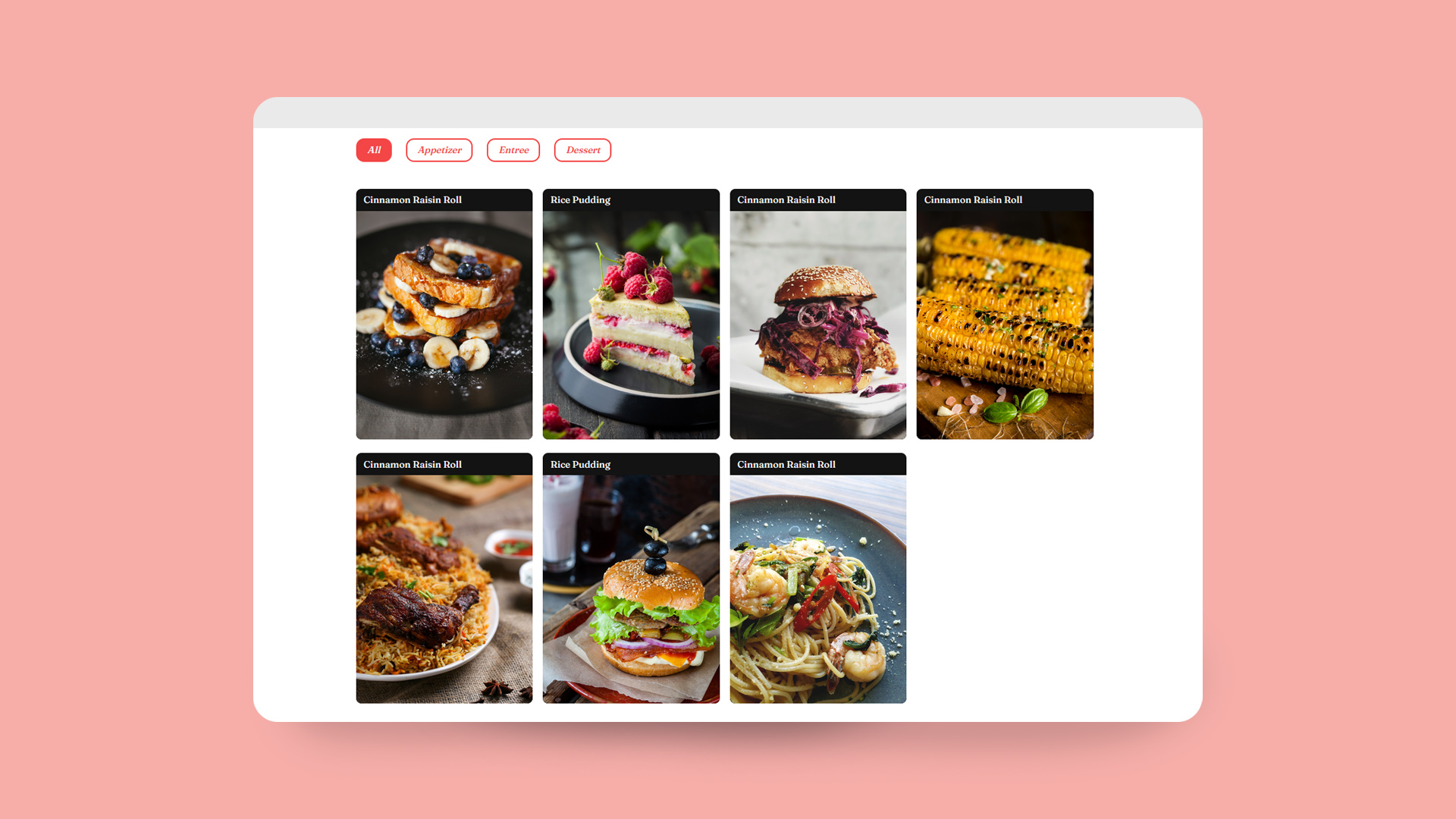
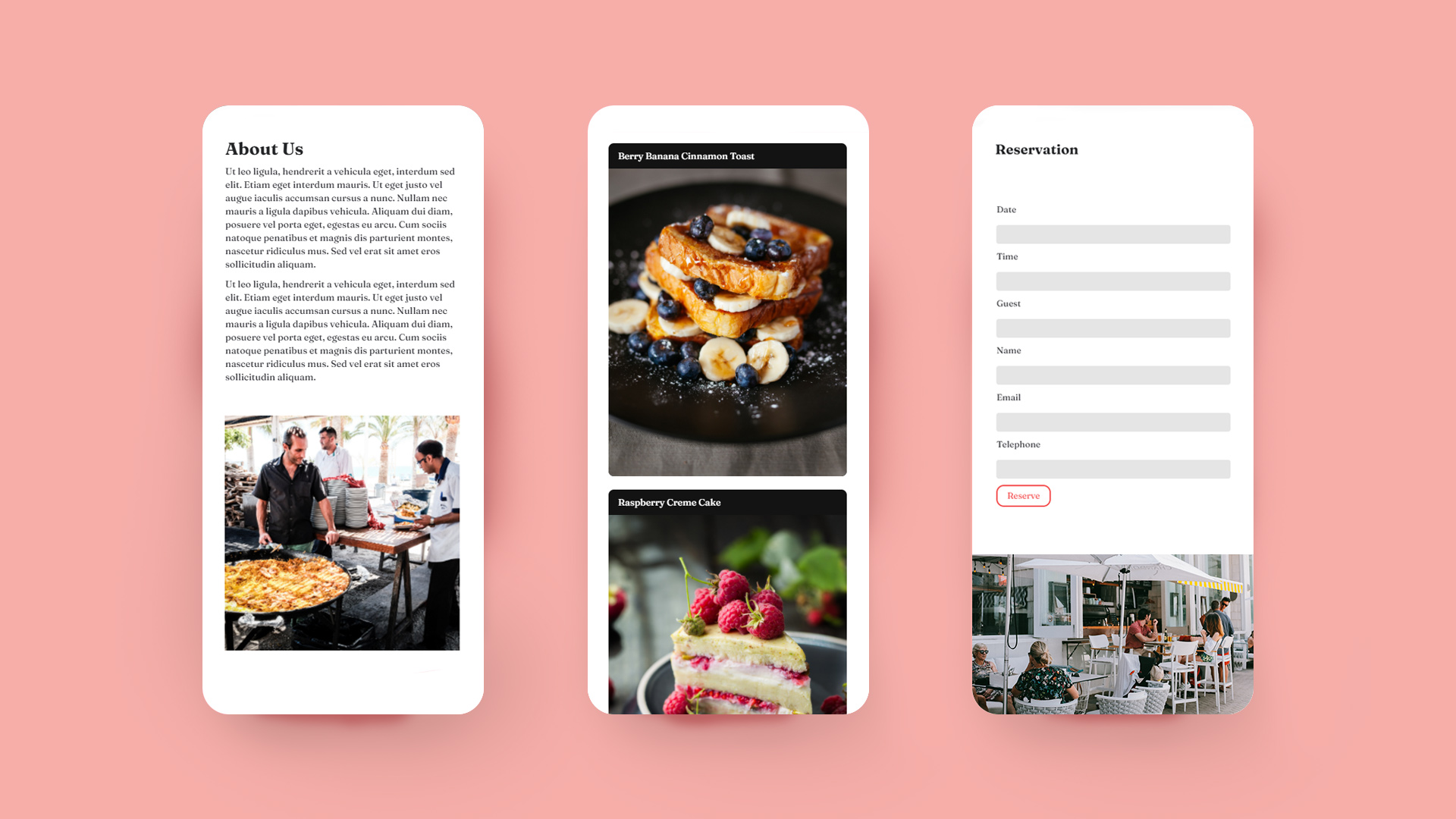
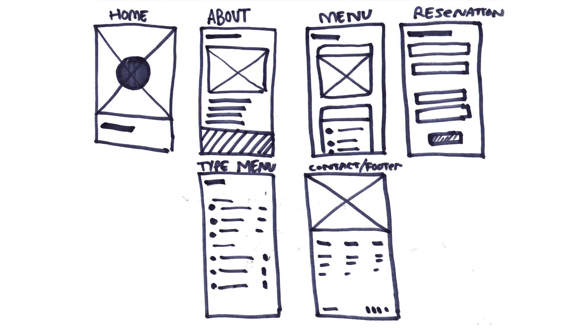
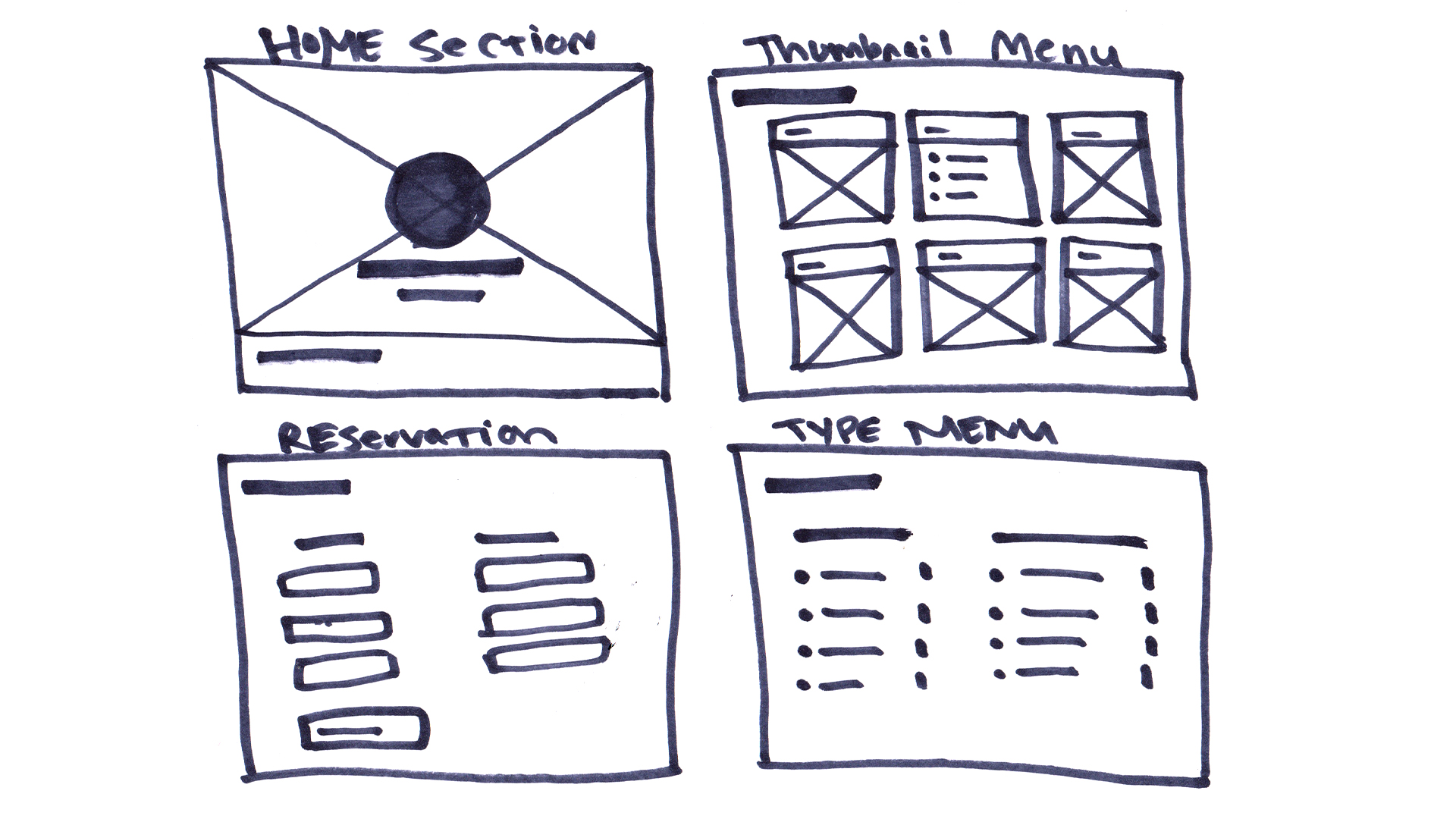
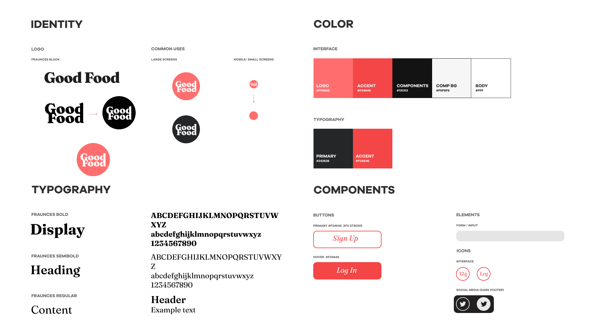
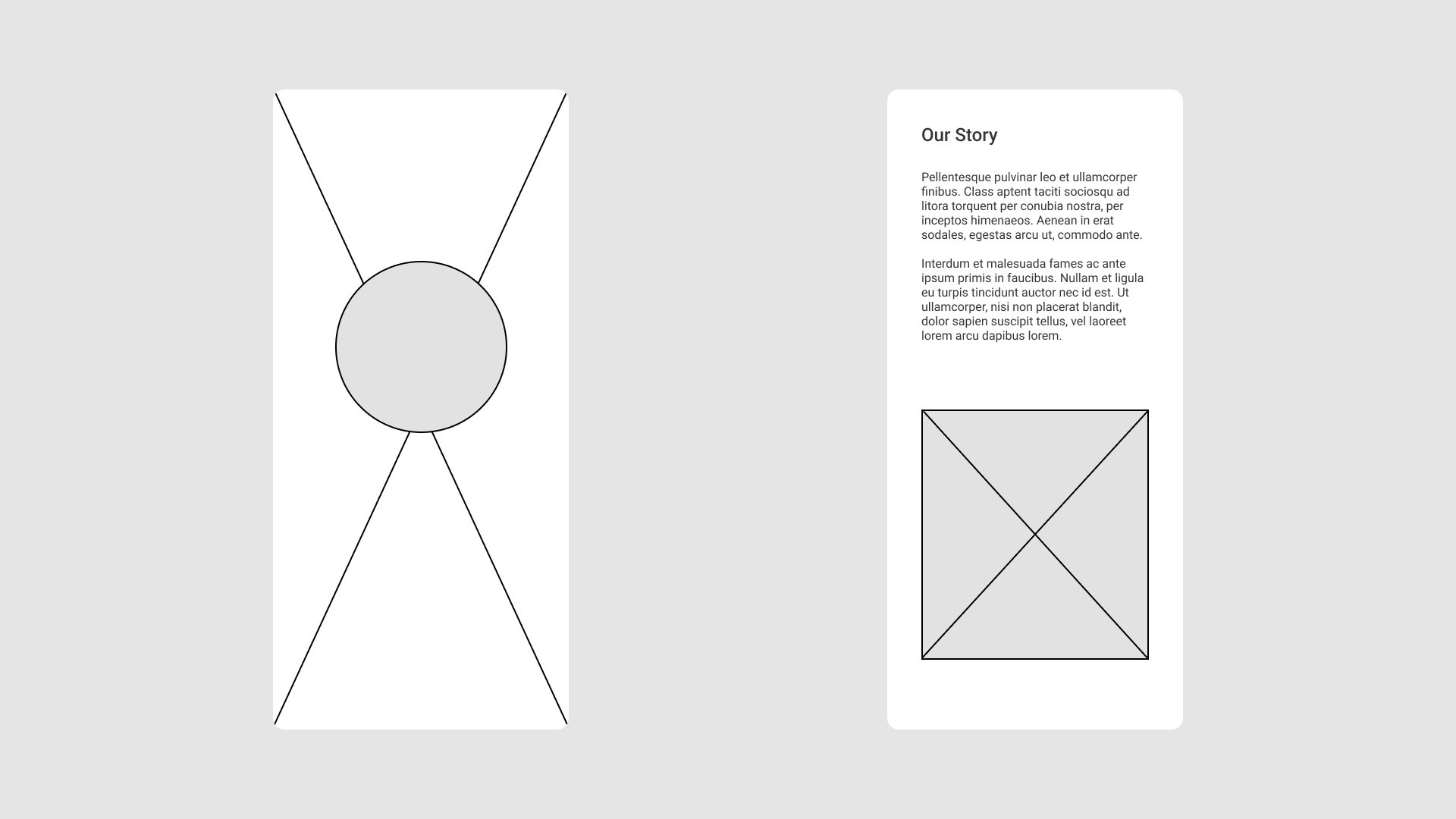
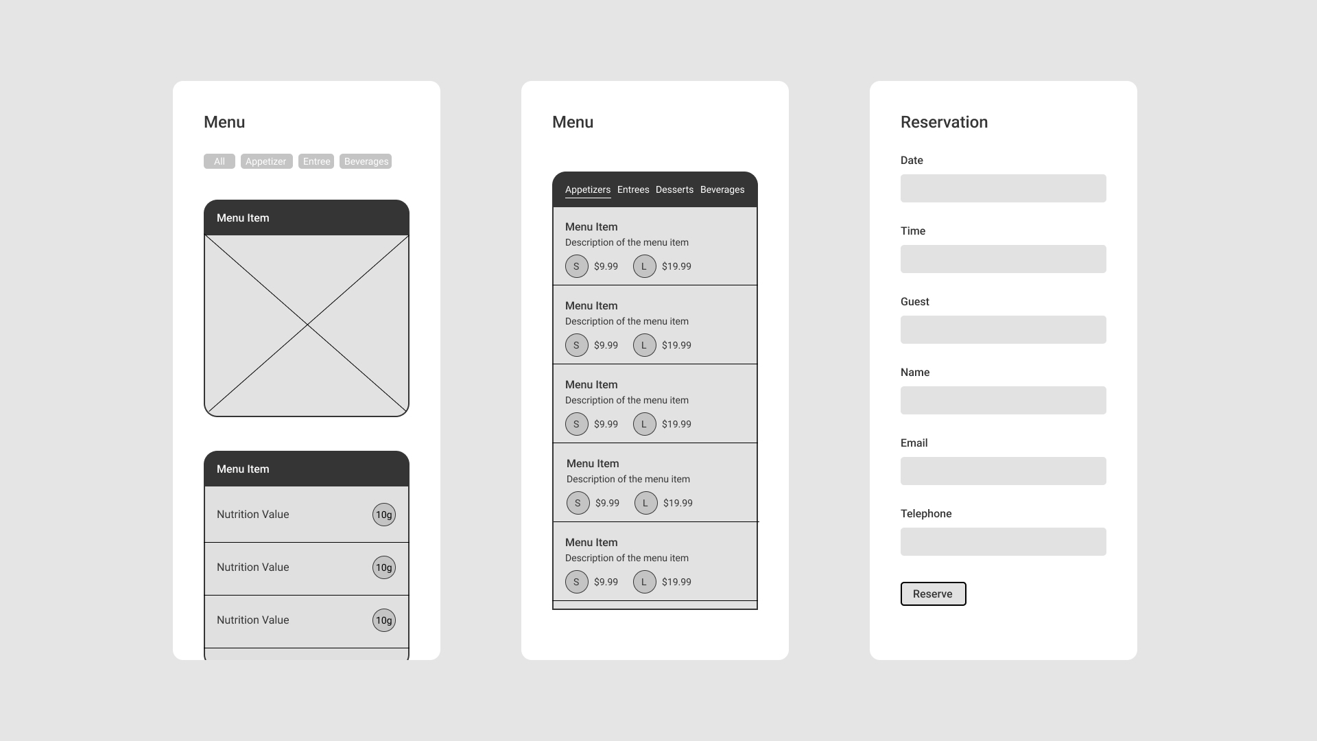
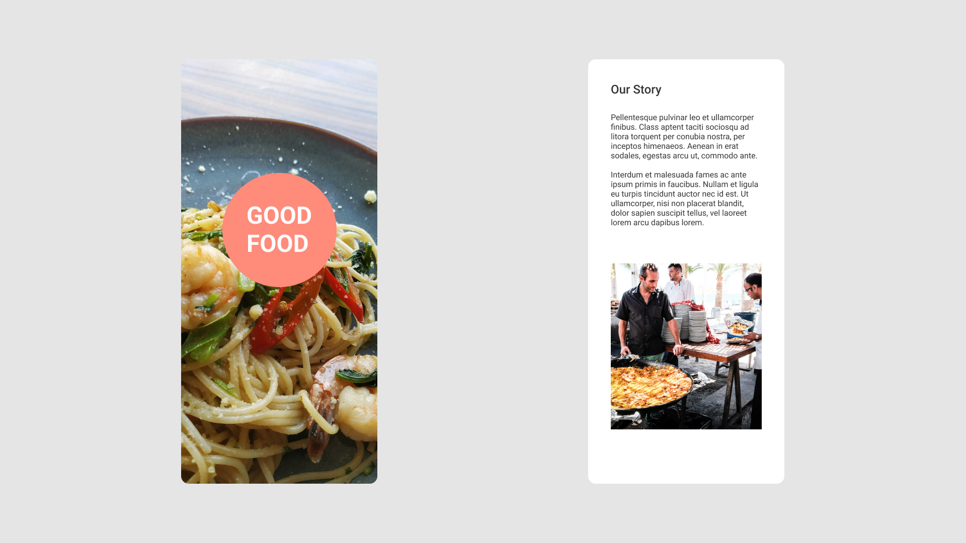
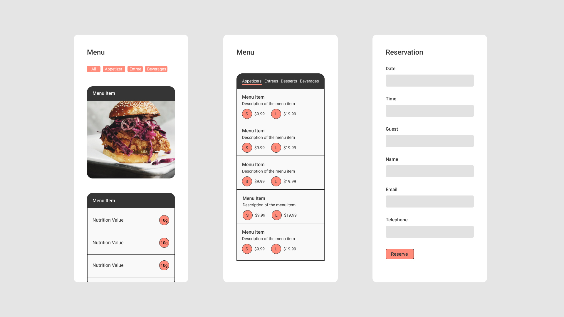
The initial sketches for Good Food consisted of various pages; however, the research pointed to a single-page website/app being the ideal approach. The reasoning behind this approach is consistent with other social apps that require a user to scroll to consume content rather than clicking on different pages, allowing the user to stay on the same page app/site longer. The sketches were then crafted into wireframes in one long-page Figma file. The project structure was organized using the approach of a first-time customer, a landing page to grab attention, followed by an about section introducing the brand/restaurant to create a connection with the customer. Following the initial introduction is the menu section which can be presented in a thumbnail or typographic version, depending on the end user’s choice. The final sections of the site are composed of the reservation form and the footer, which contains contact information and locations. With usability in mind, the design system is simple and clean, offering a minimal palette that can be customized by simply editing accent colors to give the site a new feel. The breakup of the modular sections is emphasized by parallax images that the end user can customize.
Sketches
Design System
Wireframes
Deliverables