Summary
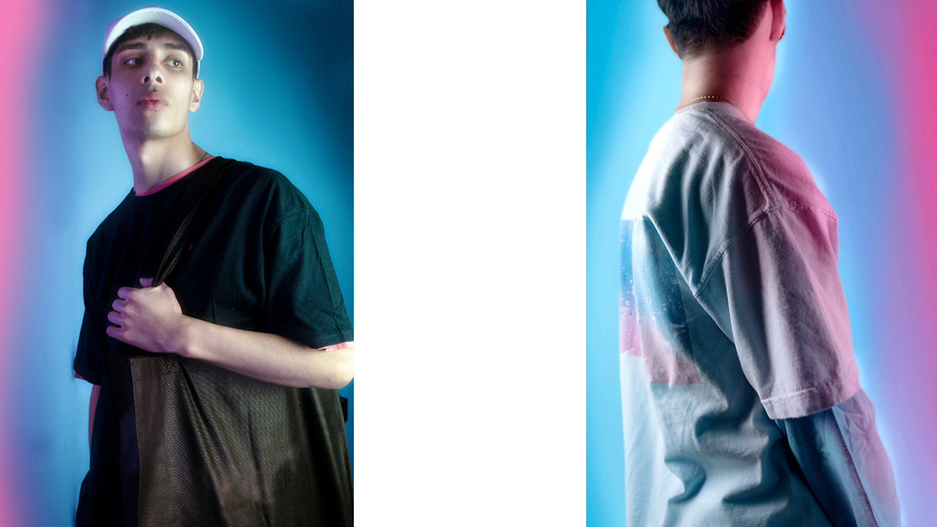
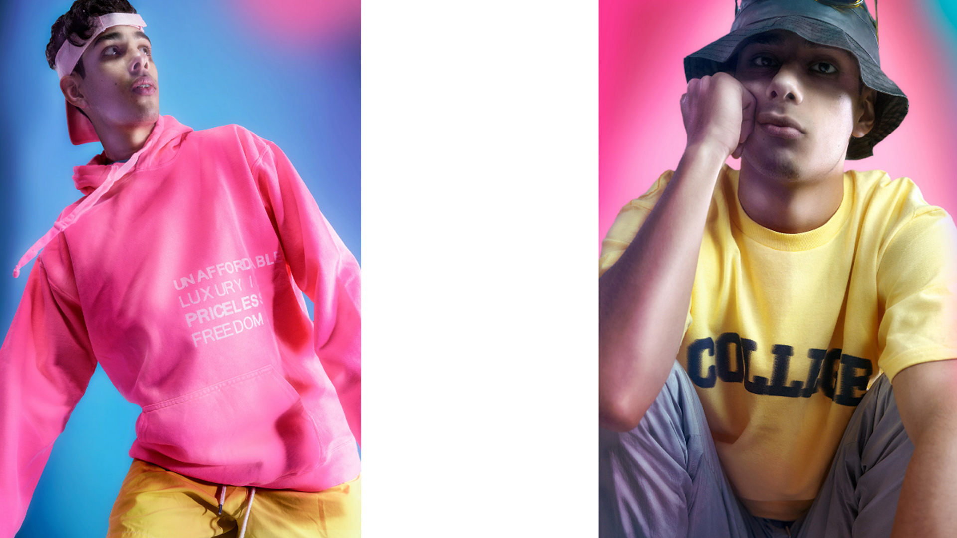
Historically the fashion market has gravitated towards woman’s wear, accounting for most of the industry and garments made. Menswear with the help of streetwear and social media is on the rise which presents an opportunity to provide an offering for the growing market. Couleur Bon sets out to capture the intersection between high end men’s fashion, streetwear, art, and design.
User Profile
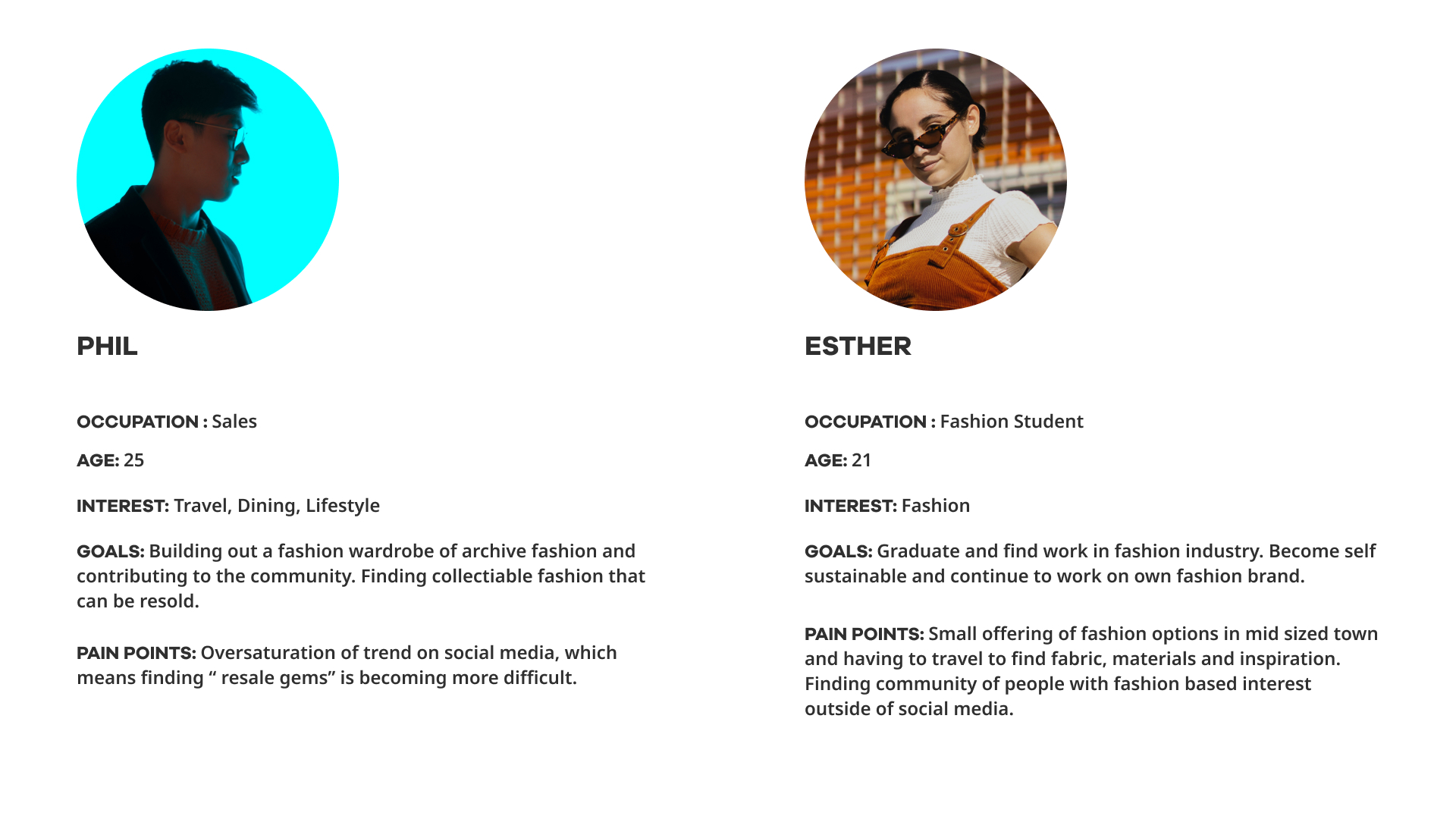
The menswear market is currently supported by millennial and gen z buyers that often encounter their first taste in fashion through social media. As a consumer base, this demographic is used to buying online and expecting an experience from brands they align with. They have a wider reference point for brands and culture, often mixing luxury/legacy brands with a typical label in a suburban mall. The customer decision in choosing brands for this demographic is driven by ethical and social issues, not just by price positioning.
Main Task
- User Research, Competitive Analysis
- Initial Sketches, Lo-fi Wireframes, Usability Testing
- HiFi Prototypes, Front End (Liquid Shopify Framework)
Project Duration: 1 Year
Tools
UX : Interviews
During the competitive analysis we found a sharp divide between perceived high-end clothing often being associated with older legacies brands and younger more youthful brands being associated with lower quality. This gap provided an open area to intersect both worlds and capture some market share in both. A common pain point and requirement for the surveyed demographic was a web experience that was immersive and interactive, in other words something that did not feel like a transaction.
UI : Figma
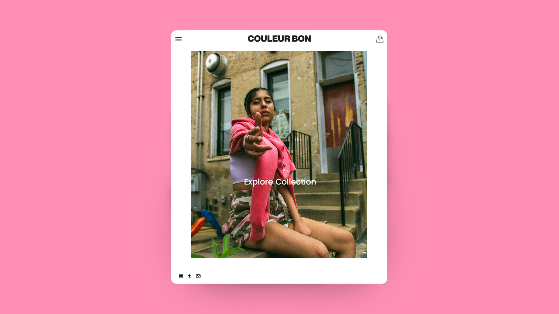
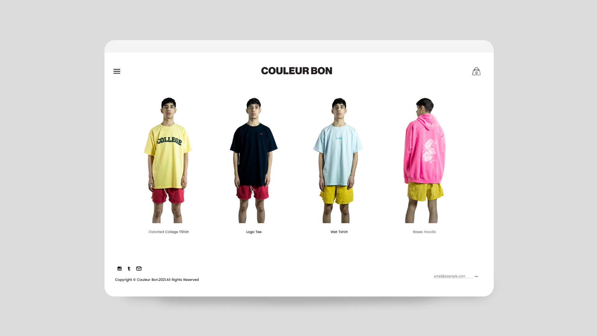
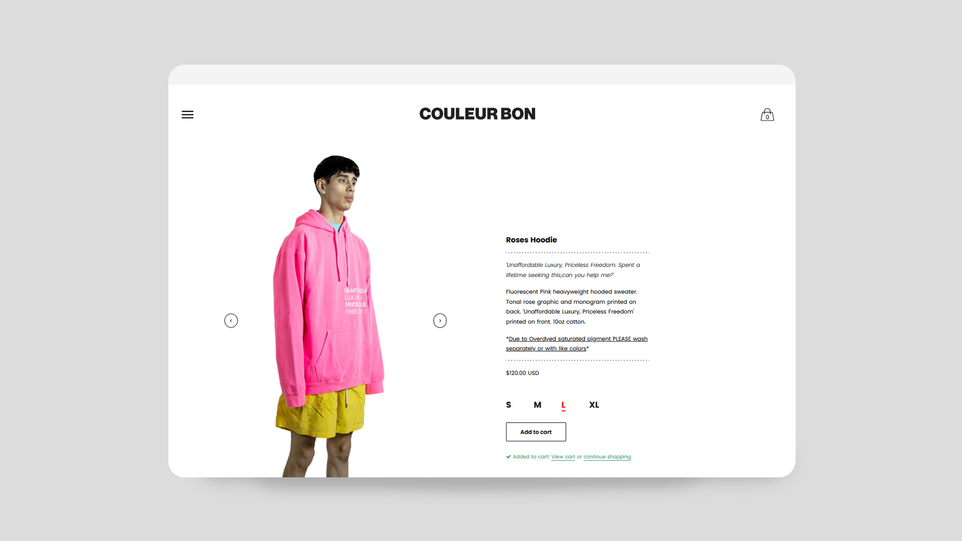
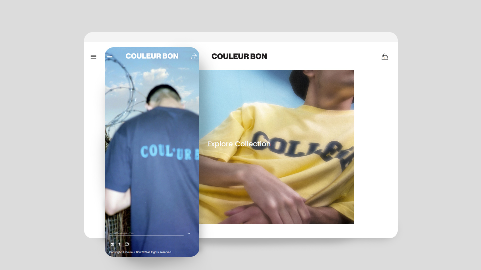
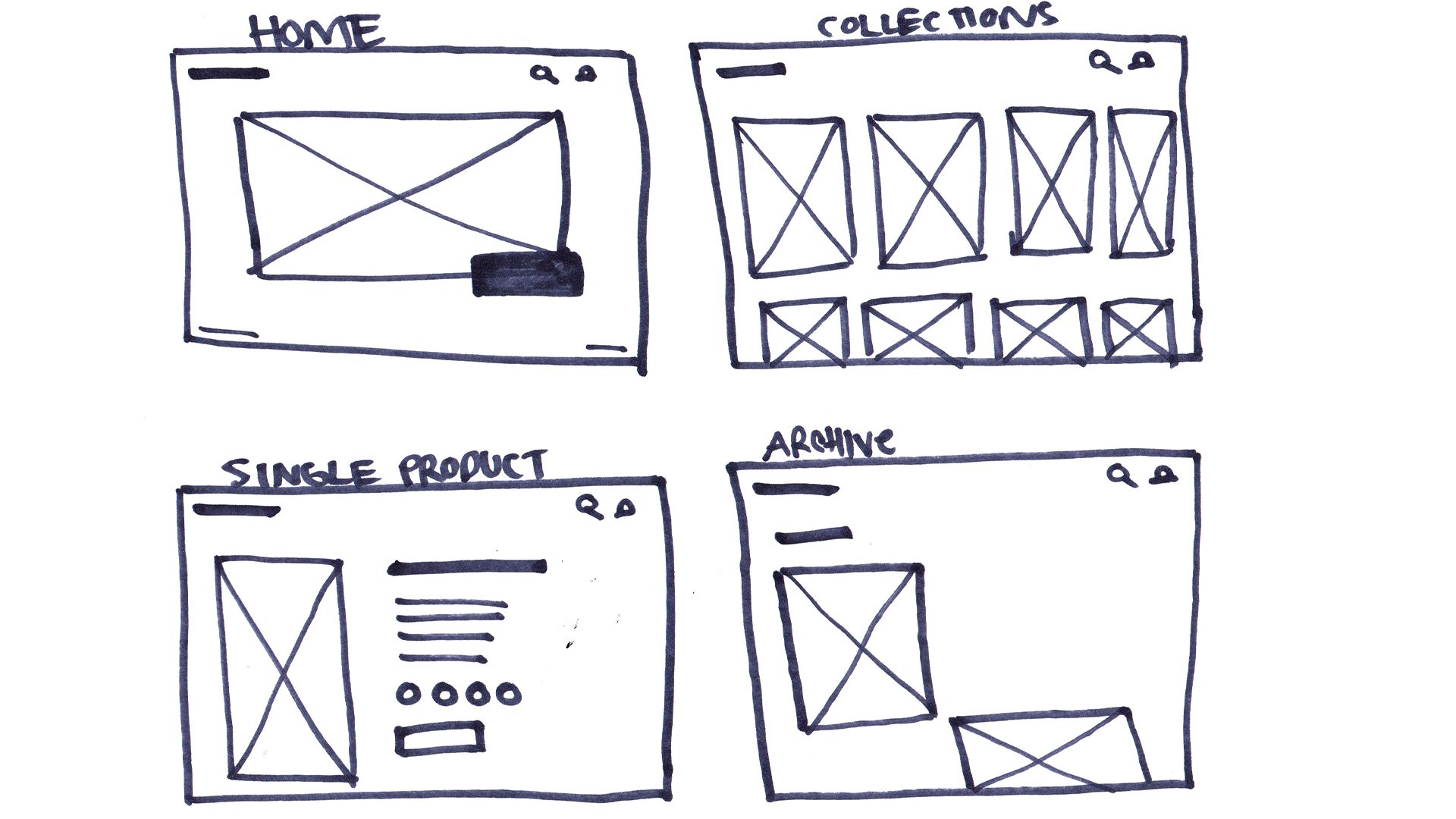
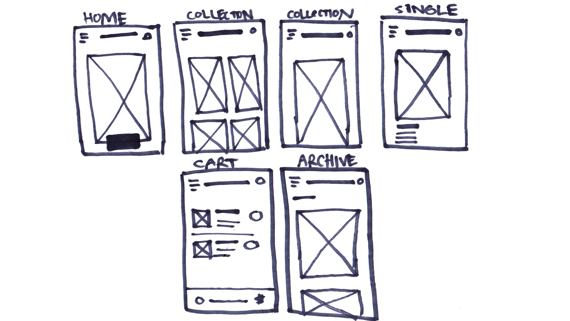
The web store was conceptualized to live on all screen sizes from mobile to large screen desktops.This required a responsive grid system to be able to showcase clothing at its optimized size for every screen and device size. The initial wire frames created in figma were built around a product card/thumbnail gallery that displays more items the bigger the screen resolution is. A custom design system was developed loosely based on the established check out page of Shopify
Sketches
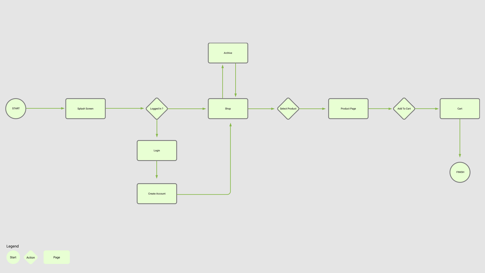
User Flow / Journey
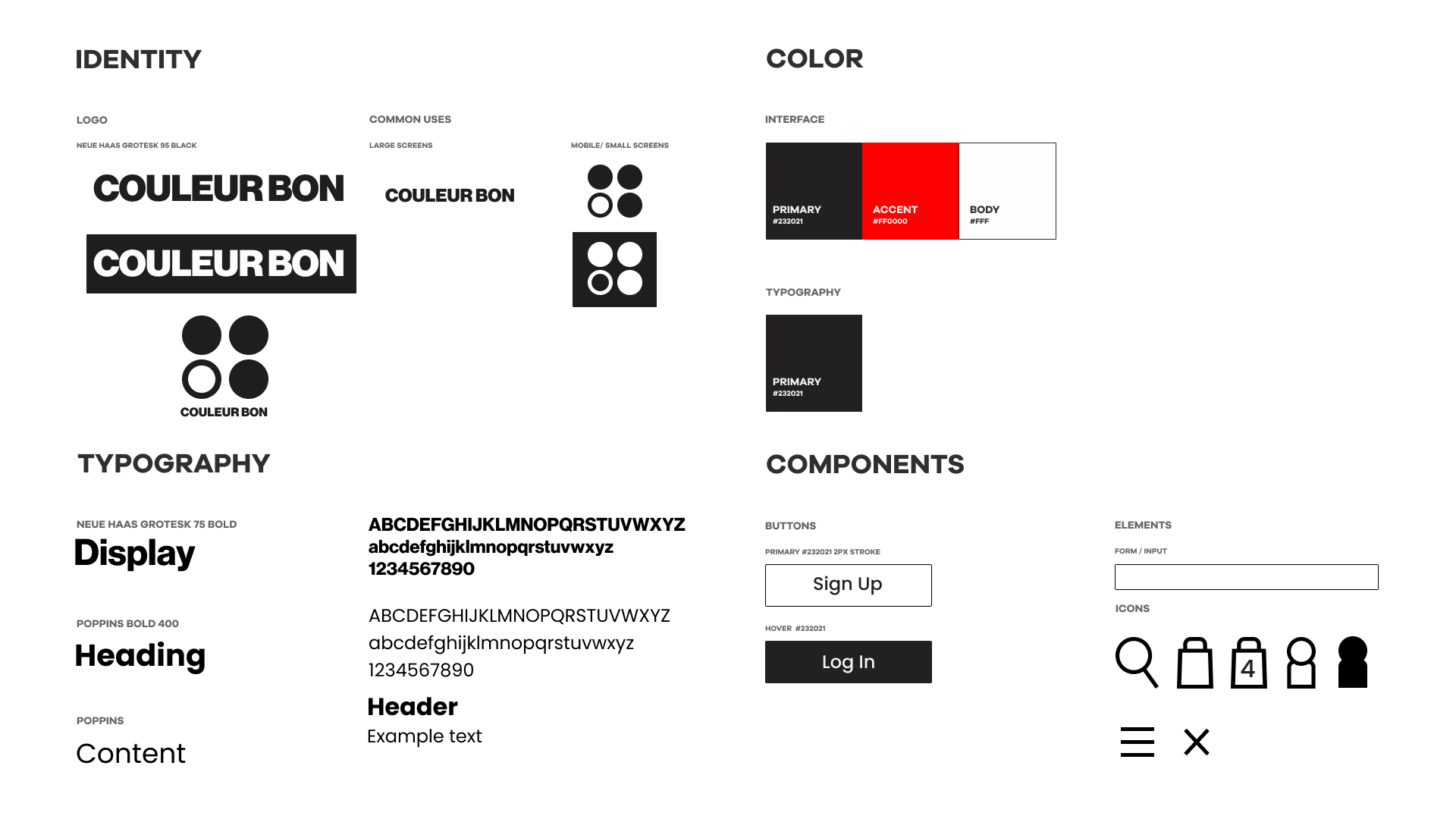
Design System
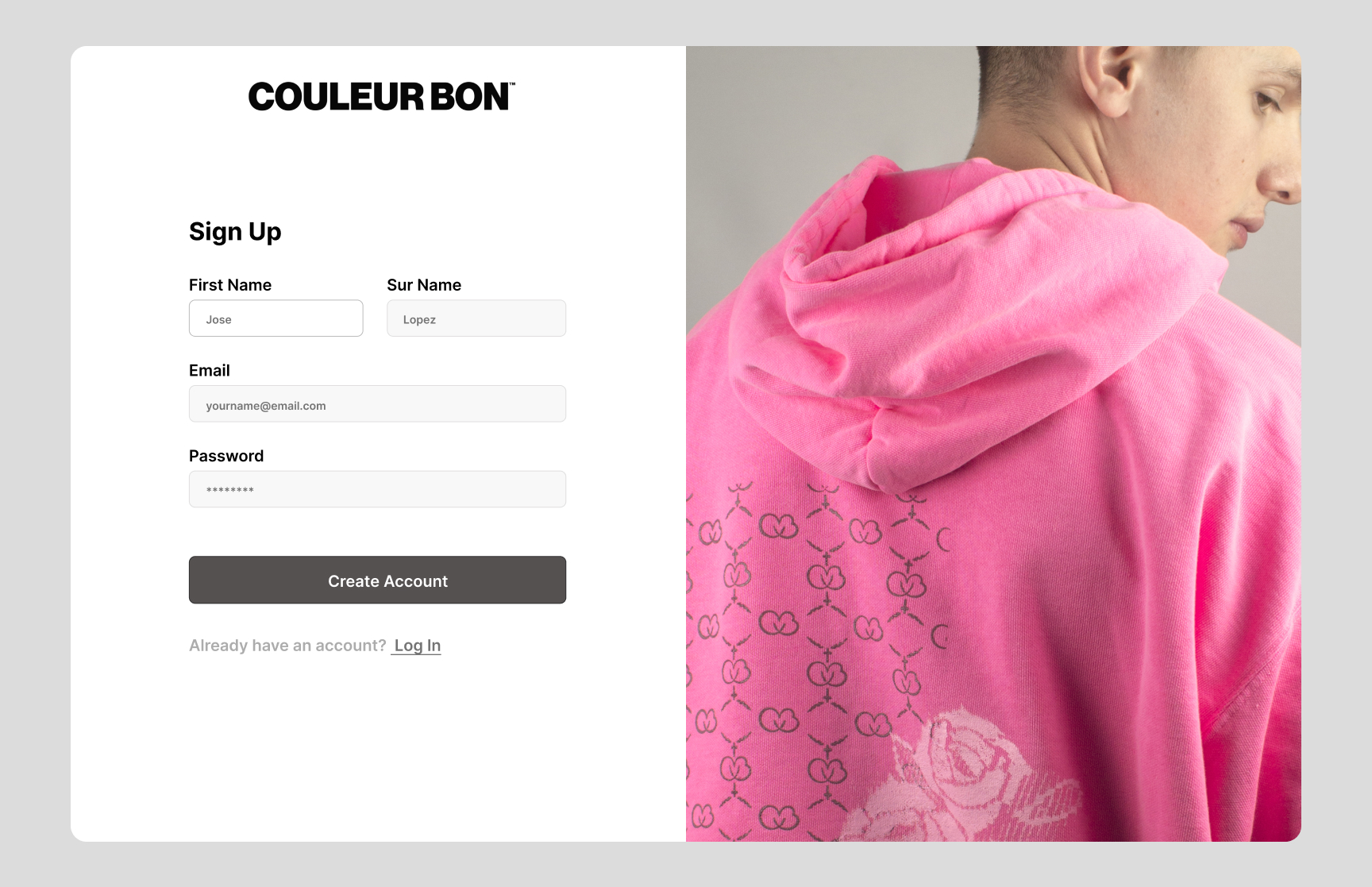
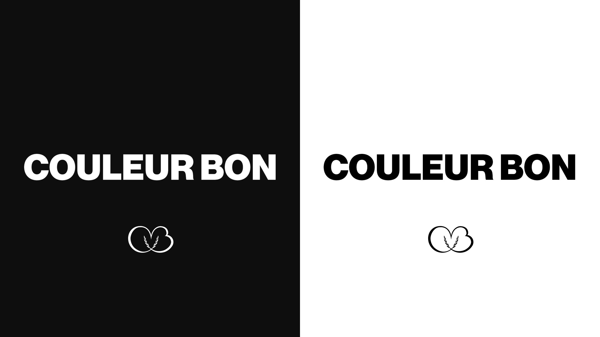
The logo design approach is referenced to monograms and regal floral designs as an ode to the traditional approach to fashion. The infinity logo. The traditional uniforms logo is mixed with a modern clean san serif font marrying the modern and the classic.
Deliverables

