Summary
Public art is widely accessible in most urban centers, beautifying and adding to the already present architecture and culture. Often, we just see the result, large scale murals which can take weeks and months to complete. This time spans are often made more difficult by the accessibility to quality spray paint. The appeal of spray paint in public art is due to its ability to cover large areas fast and its vibrant opacity and wide color palette. The difficulty to obtain the color hue or color can prolong the already exhausting task of painting a mural.
When working on something as present and obvious as public art, the smallest details are perceivable to the viewer. Two seemingly similar tones of green can look completely different at 100feet. The current market of artist spray paint, not to be confused with hobby and household paint available at a hardware store, is dominated by European spray brands. The niche nature of public art makes locations where paint is available far and few.
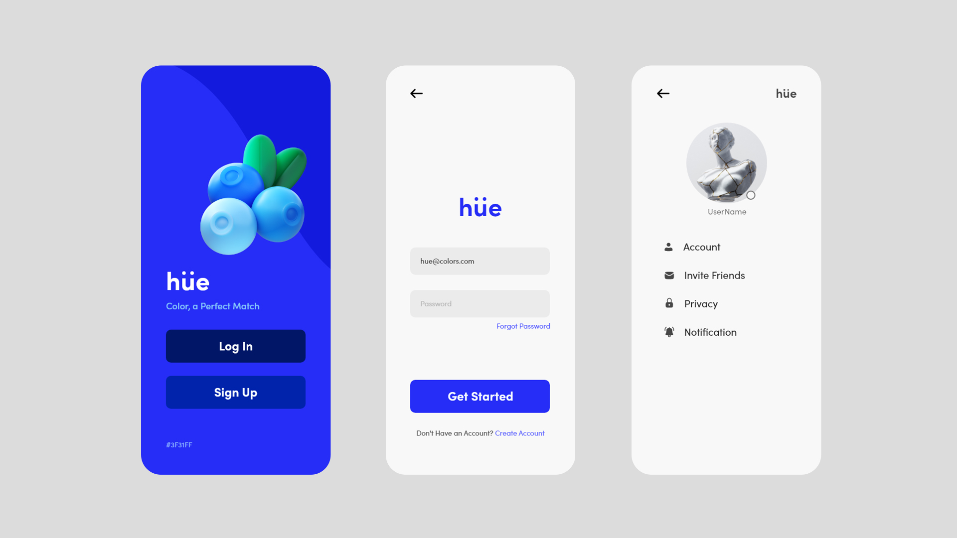
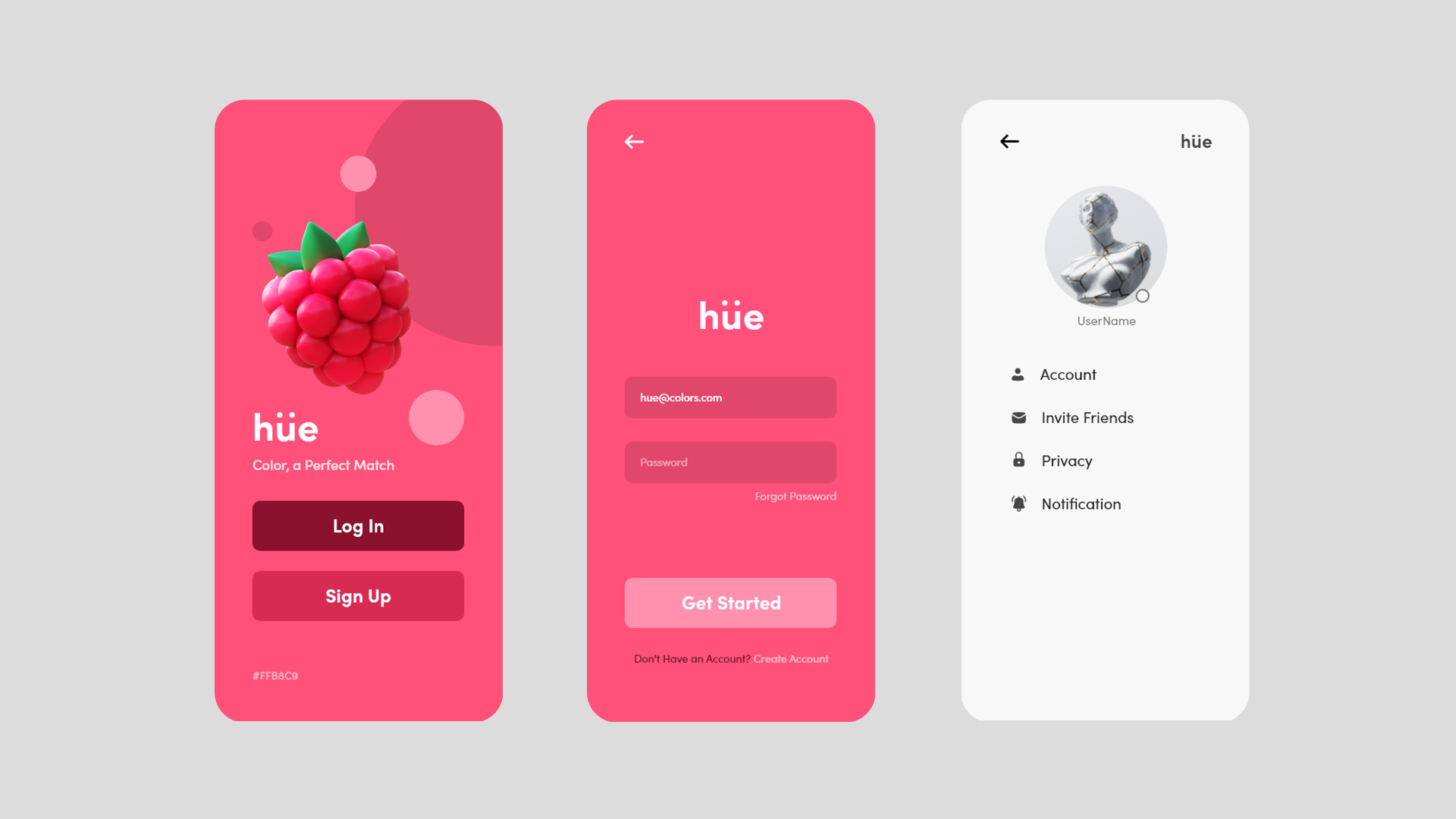
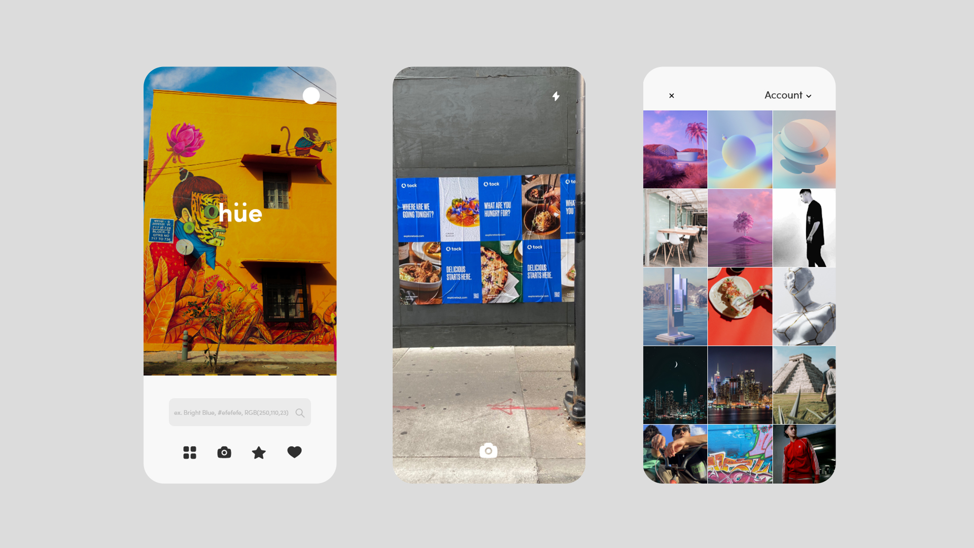
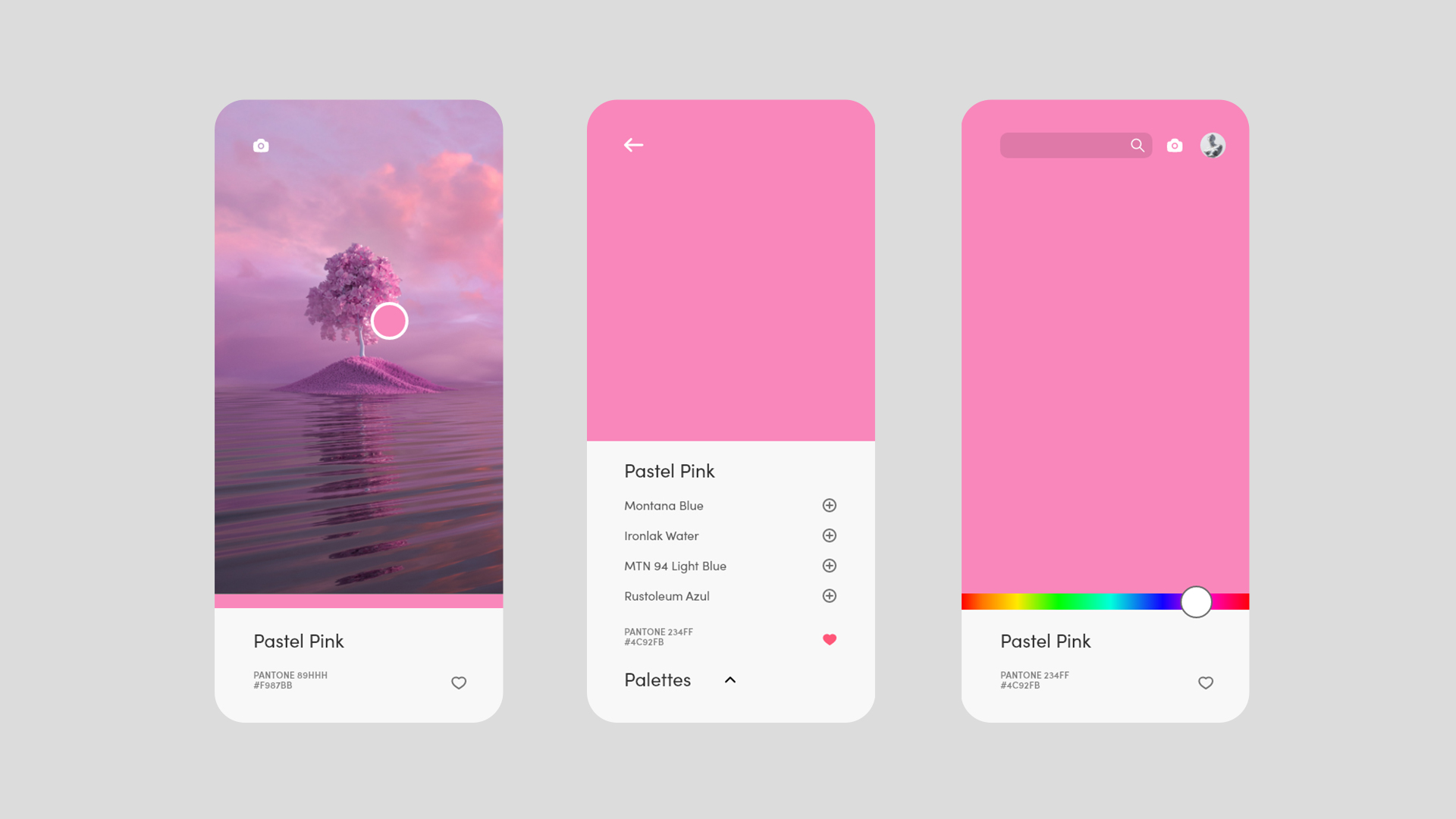
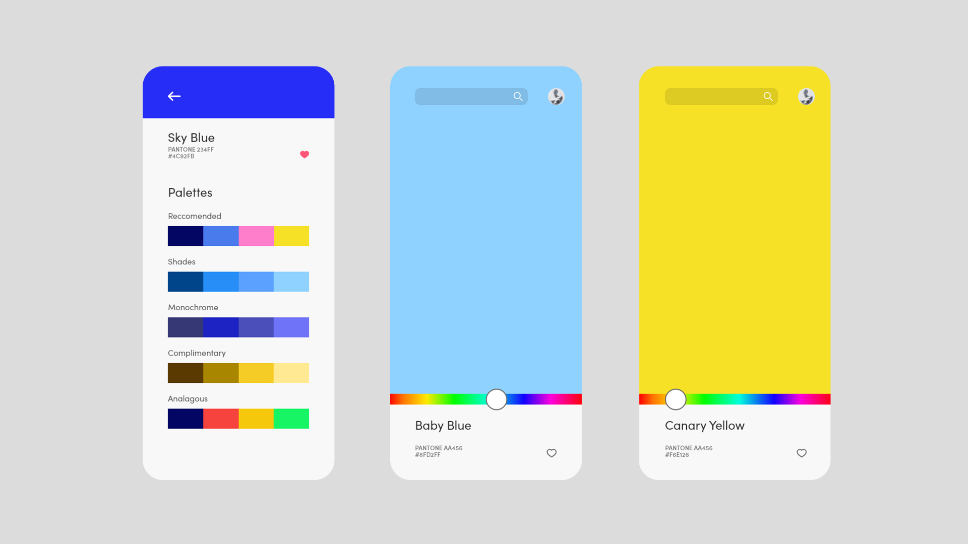
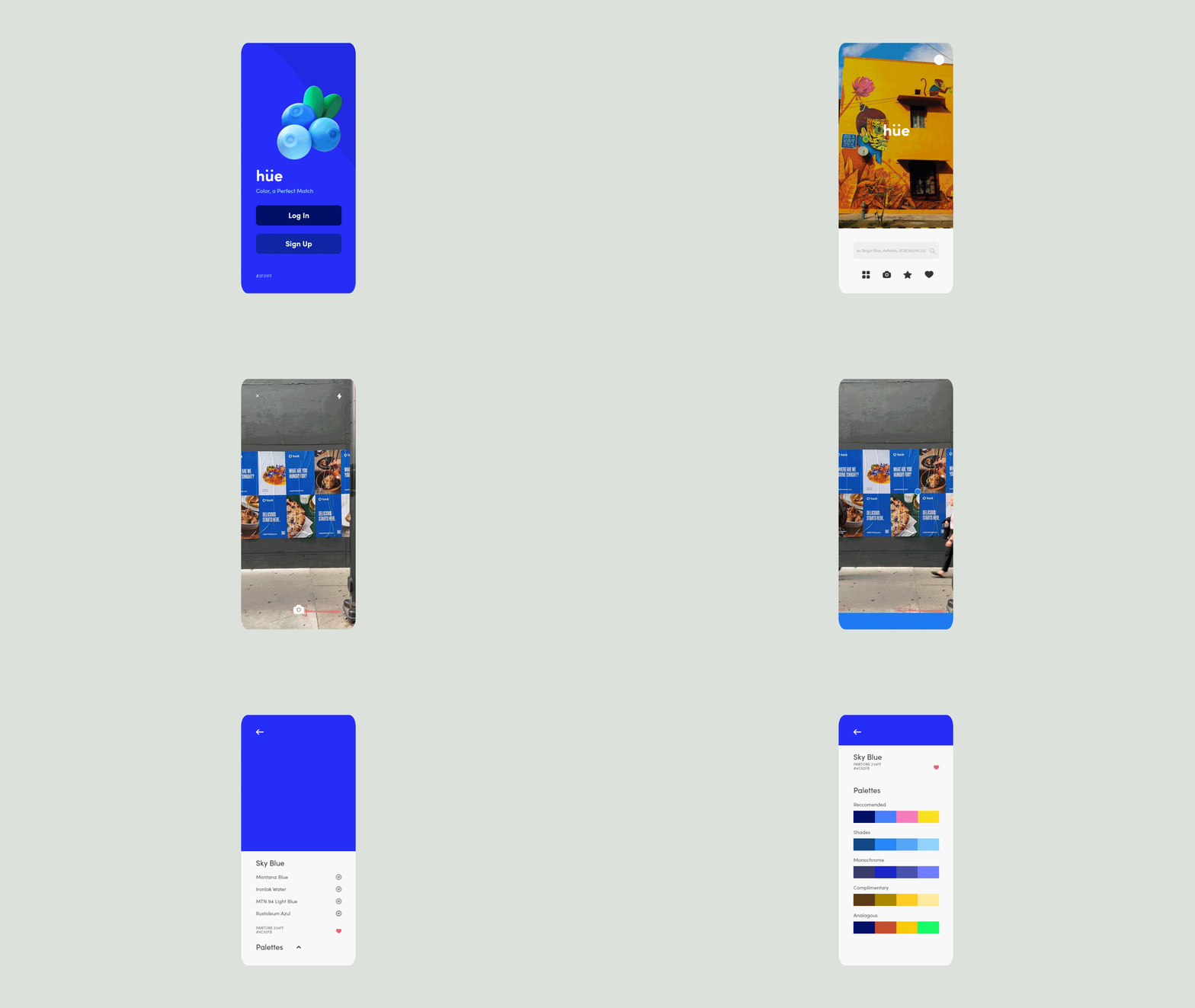
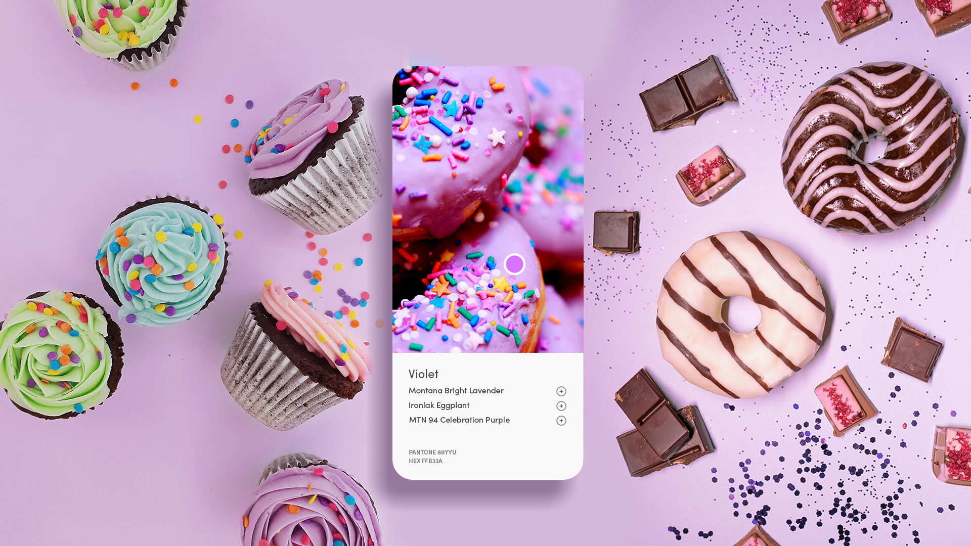
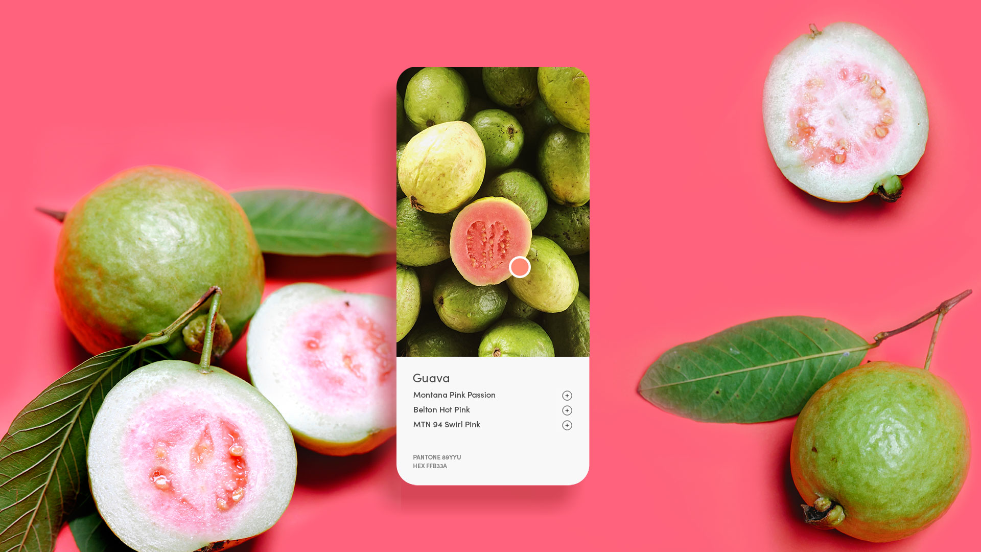
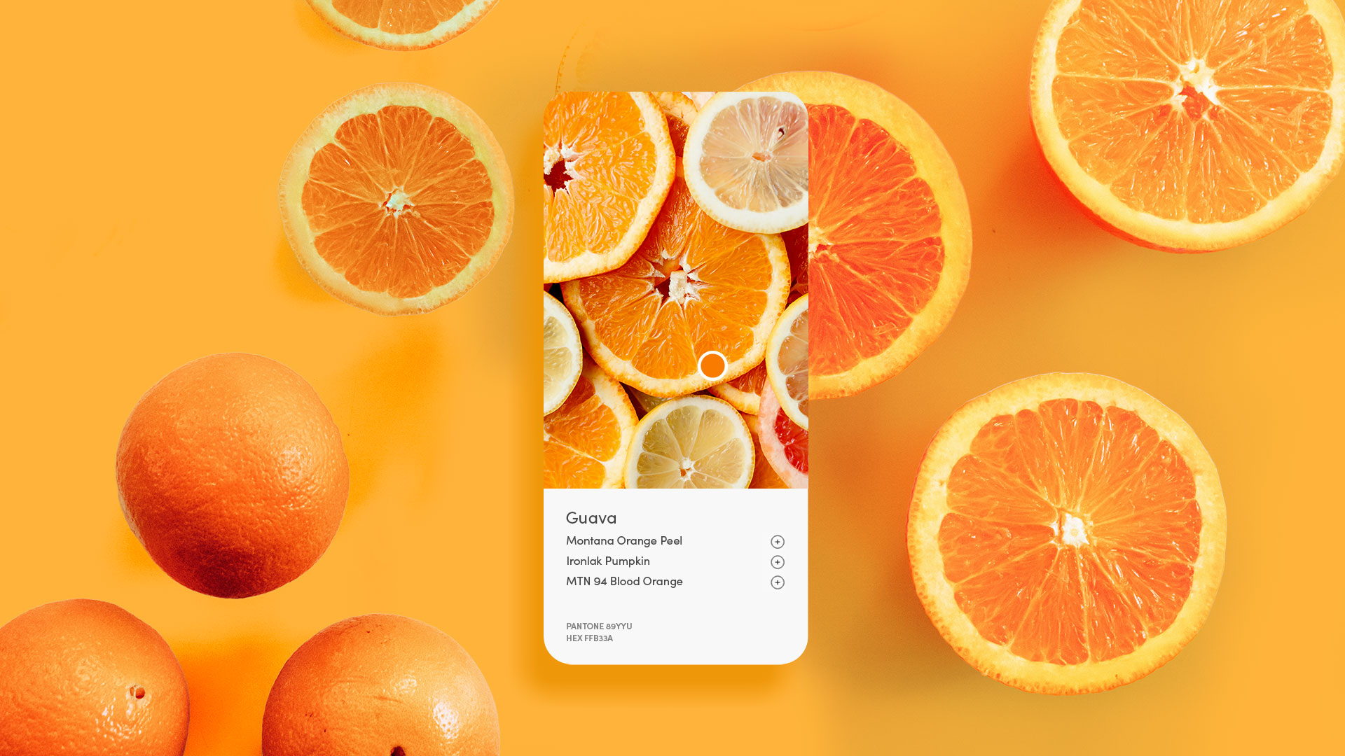
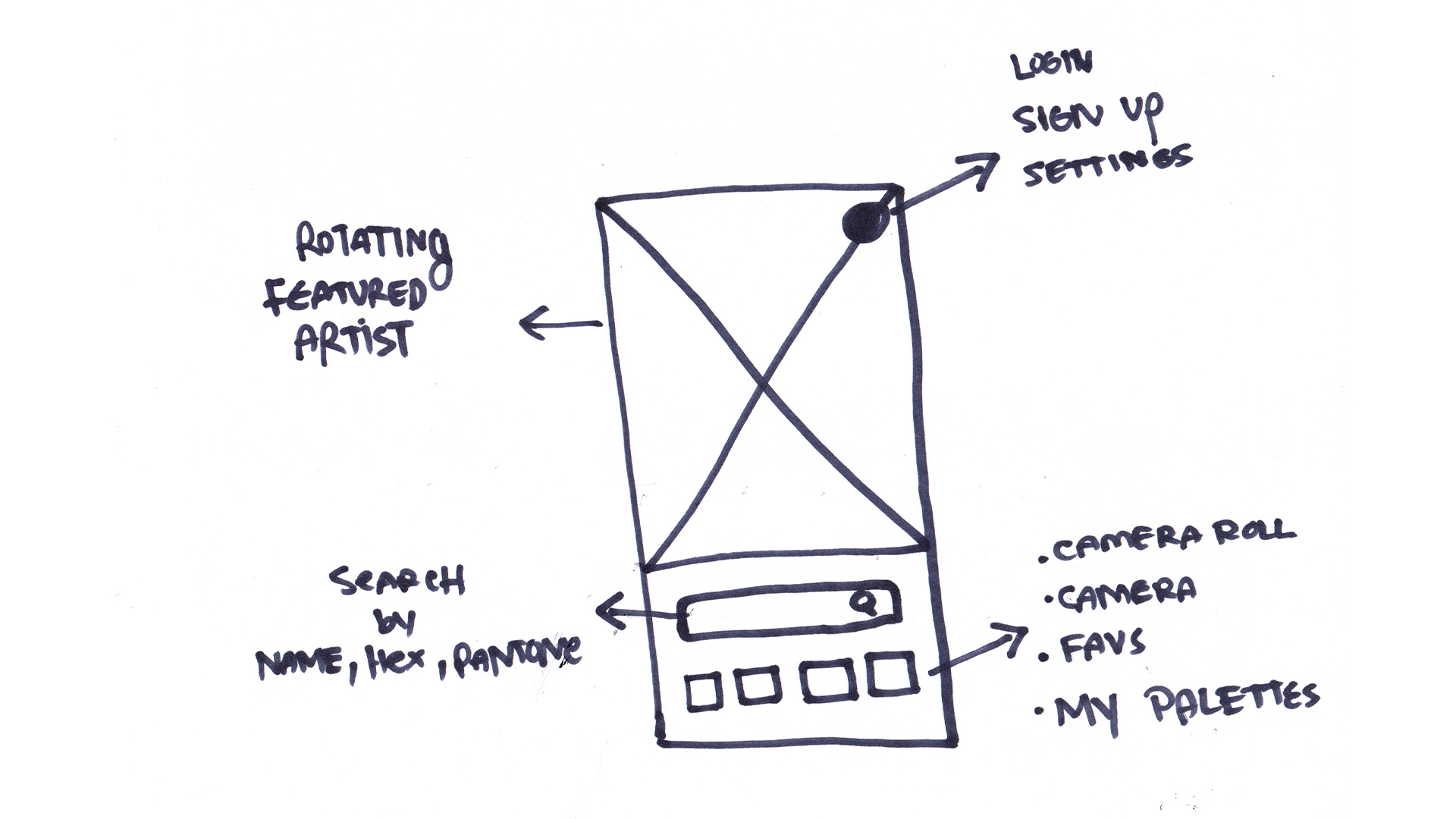
Hue sets out to create a platform where an artist can color match a hue of paint to the closest match regardless of competing brands. The user has the choice between taking a picture, uploading from their device, or simply adding a hex code/ pantone to obtain a color match. Hue also provides a palette system to assist in the selection of colors.
User Profile
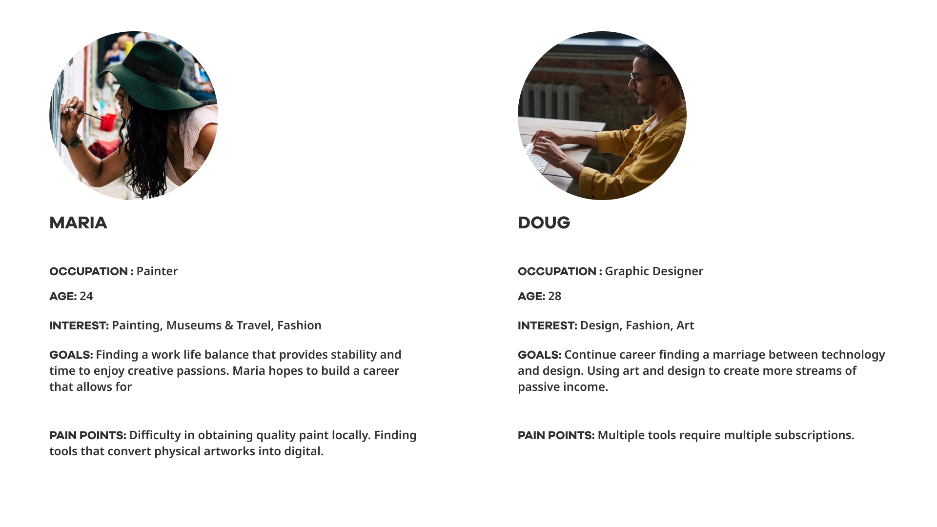
The user persona of a person who uses the app, is but not limited, to an artist. The proficiency and level of experience can be from novice to world renown artist, as the app provides value to both. The ideal user would have a mid-level understanding of color theory and design principles allowing for a better experience in building color palettes as well as navigating the color selection using hex codes. The user spends a portion of their discretionary income on art supplies, often more then on other forms of entertainment.
Main Task
- Strategy & Ideation
- Initial Sketches, Lo-fi Wireframes, Usability Testing
- HiFi Prototypes, Animated Prototype
Project Duration: 6 Months
Tools
UX : Interviews & Competitive Analysis
The approach for the UX component of Hue is collected from interviews of artist currently active and creating work. A survey was created to canvas the current tools available for the creation of large-scale murals as well as any pain points found within those systems. Pantone is the closest competitor in market; however the interface does not provide a real world alternative for artistic mediums. The biggest pain point found in the research was the inconsistency between the labeled color vs what the color will look like on a wall once the paint is dry.
UI : Figma, After Effects
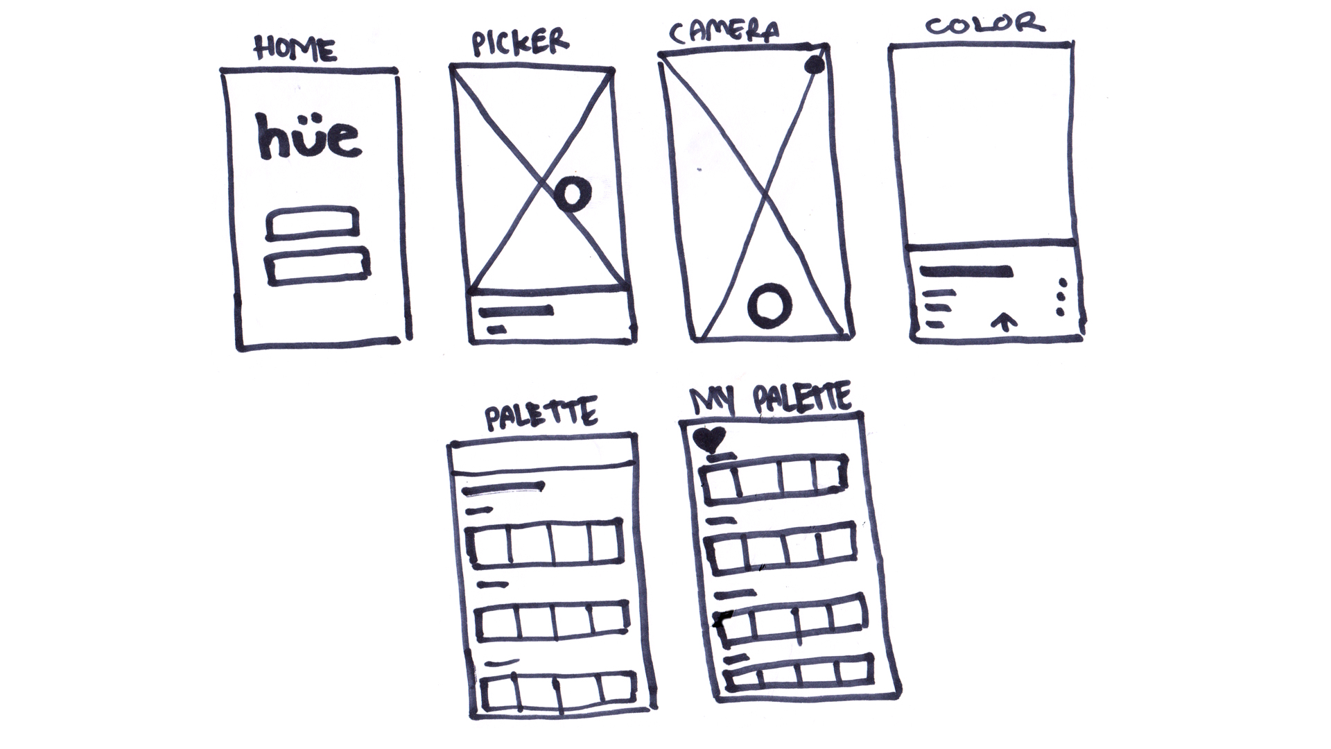
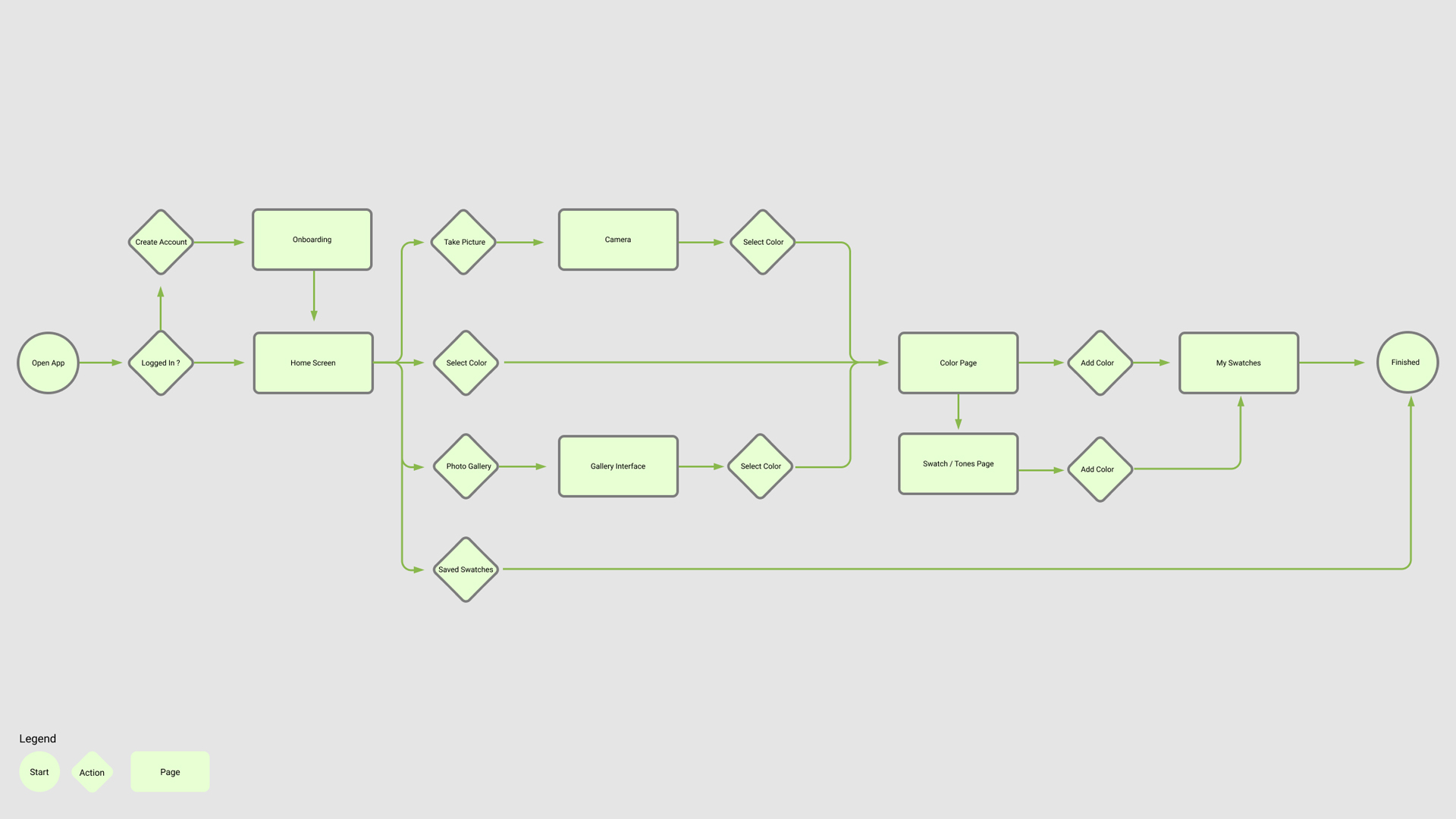
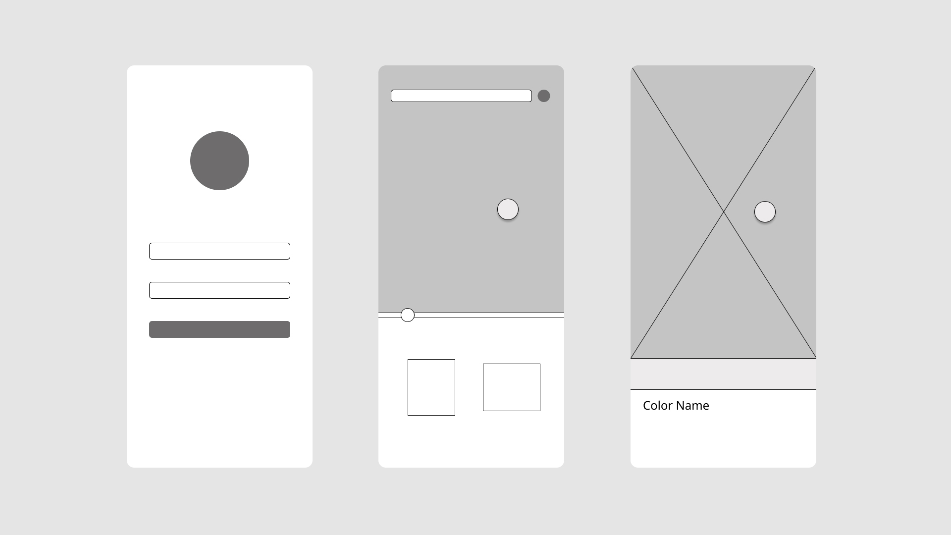
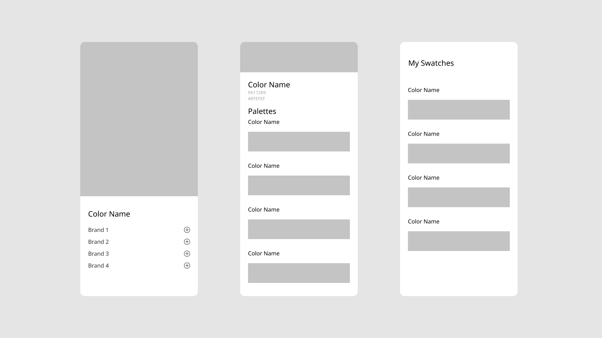
The initial sketches were based on a mobile framework; however, a desktop version was also envisioned. The case for a mobile centered design was the accessibility of using it out in the field while actively painting a work or installation. The low fidelity wireframes focused on user flows and ultimately the goal of the app, which is to allow the user to build palettes within the app. This brings the social component to the app, allowing for users to share their created palettes or colors. A final video prototype was created using the Figma protypes imported into Adobe After Effects. This was done to visualize the micro animations and user flow.
Sketches
User Flow / Journey
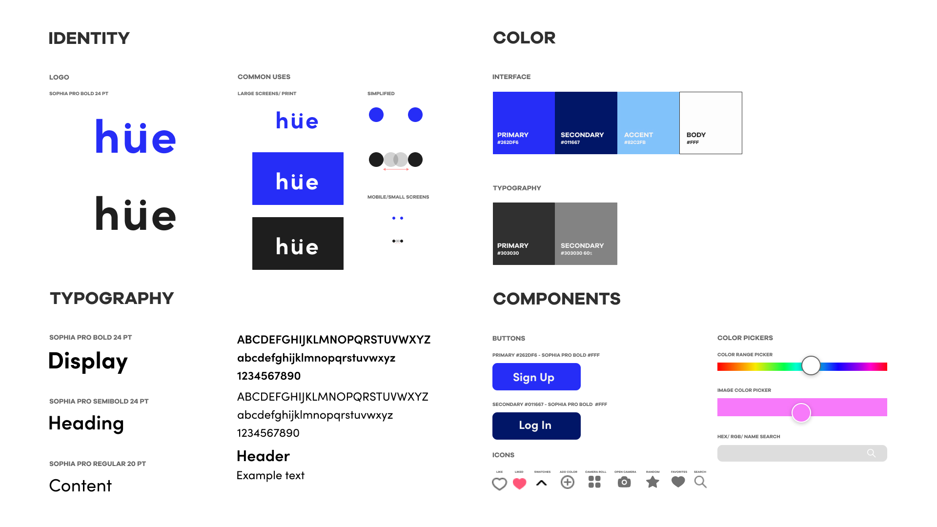
Design System
Wireframes
Deliverables
